Styled-Componentsとは
Styled-components(スタイルドコンポーネント)は、ReactアプリケーションでCSSを管理するためのライブラリです。
CSSを直接作成する代わりに、JavaScriptのテンプレートリテラル記法を使用してスタイルを作成し、Reactコンポーネントに適用します。
動的なスタイルのサポートやコンポーネントの再利用性を提供し、サーバーサイドレンダリングにも対応しています。
Reactコミュニティで広く使われているCSS-in-JSの一つで、Reactアプリケーションのスタイリングを簡潔かつ効果的に行うための強力なツールです。
styled-componentsを使用すると、CSSスタイルを含むReactコンポーネントを簡単に定義できます。
事前準備
- styled-componentsを実装するため、まずはReactアプリを作成します。
npx create-react-app APP_NAME --template typescriptApp.tsxを更新します。
function App() {
  return (
    <div className="App">
      Learn React
    </div>
  );
}
export default App;
インストール
styled-componentsを以下の通りにインストールします。
# npmを使用する場合
npm install styled-components

# yarnを使用する場合
yarn add styled-components
Reactや他の依存関係が古いバージョンの場合には、エラーが発生する可能性があります。その場合は、babel-plugin-styled-componentsを導入することでエラーが解消されることがあります。
(※エラーが出なければ、babel-plugin-styled-componentsのインストールは不要です!)
# npmを使用する場合
npm install babel-plugin-styled-components --save-dev

# yarnを使用する場合
yarn add babel-plugin-styled-components --dev
実装
- インポート
styled-componentsを使用するために、ライブラリをインポートします。
import styled from 'styled-components'- 基本的な記述方法
styled.[HTMLタグ] `...`でスタイルを記述します。
const [コンポーネント名] = styled.[HTMLタグ]`
--------------------------------------------
------------------[CSS]---------------------
--------------------------------------------`
HTML tags | styled-components |
|---|---|
section | styled.section |
div | styled.div |
h1~h6 | styled.h1~styled.h6 |
img | styled.img |
a | styled.a |
button | styled.button |
p | styled.p |
span | styled.span |
早速作ってみましょう!
1. HTMLタグを使用したstyled-components
- <section>を使用したstyled-components
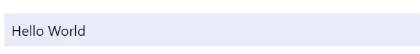
sectionタグに背景色を適用します。
import styled from "styled-components";

const MainContainer = styled.section`
  width: 50%;
  height: 100%;
  padding: 0.5rem;
  margin: 2rem;
  background-color: #e8ecfb;
`;

function App() {
  return <MainContainer>Hello World</MainContainer>;
}

export default App;
出力結果
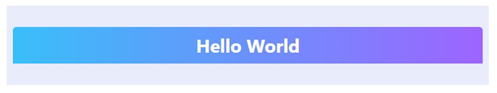
- <h1>を使用したstyled-components
h1タグのコンポーネントを追加します。
const Title = styled.h1`
  color: white;
  text-align: center;
  padding: 0.5rem;
  background: linear-gradient(to right, #39bff9, #9d64ff);
  border-top-left-radius: 0.3rem;
  border-top-right-radius: 0.3rem;
`;
function App() {
  return (
    <MainContainer>
      <Title>Hello World</Title>
    </MainContainer>
  );
}
export default App;
出力結果
2. propsを使用したstyled-components
import React from 'react';
import styled from "styled-components";
const MainContainer = styled.section`
width: 50%;
height: 100%;
padding: 0.5rem;
margin: 2rem;
background-color: #e8ecfb;
`;
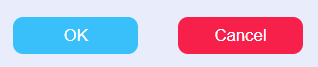
const Button = styled.button<{ buttonType?: string }>`
width: 100px;
height: 30px;
color: white;
border: none;
border-radius: 0.5rem;
margin: 1rem;
text-align: center;
background-color: ${({ buttonType }) => buttonType==="ok" ? "#39bff9":"#f7204b"};
`
function App() {
return (
<MainContainer>
<Button buttonType="ok">OK</Button>
<Button>Cancel</Button>
</MainContainer>
);
}
export default App;
出力結果
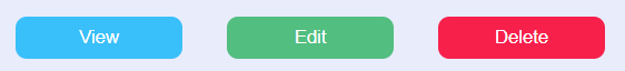
3. スタイルの拡張
あるstyled-componentから他のstyled-componentを呼び出して使用することもできます。
import React from 'react';
import styled from "styled-components";

const MainContainer = styled.section`
  width: 50%;
  height: 100%;
  padding: 0.5rem;
  margin: 2rem;
  background-color: #e8ecfb;
`;

const DefaultButton = styled.button`
  width: 100px;
  height: 30px;
  color: #FDFEFE;
  border: none;
  border-radius: 0.5rem;
  margin: 1rem;
  align:center;
  background-color: #39bff9;
`

const ModifyButton = styled(DefaultButton)`
  background-color: #52BE80;
`

const DeleteButton = styled(DefaultButton)`
  background-color: #f7204b;
`

function App() {
  return (
    <MainContainer>
      <DefaultButton>View</DefaultButton>
      <ModifyButton>Edit</ModifyButton>
      <DeleteButton>Delete</DeleteButton>
    </MainContainer>
  );
}

export default App;
出力結果
4. カスタムコンポーネントとして使用
“as” polymorphic propを使ってcustom componentに作成したstyled-componentsを適用することもできます。
import React,{ ReactNode } from 'react';
import styled from "styled-components";
const MainContainer = styled.section`
width: 50%;
height: 100%;
padding: 0.5rem;
margin: 2rem;
background-color: #e8ecfb;
`;
const DefaultButton = styled.button`
width: 120px;
height: 30px;
color: #FDFEFE;
border: none;
border-radius: 0.5rem;
margin: 1rem;
align:center;
background-color: #39bff9;
`
interface CustomButtonProps {
prefix?: string;
suffix?: string;
children: ReactNode; // Use ReactNode to allow any valid React child elements
}
const CustomButton = ({ prefix, suffix, children, ...props }: CustomButtonProps) => {
const modifiedText = `${prefix ? prefix : ''} ${children} ${suffix ? suffix : ''}`;
return <DefaultButton {...props}>{modifiedText}</DefaultButton>;
};
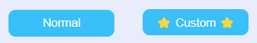
function App() {
return (
<MainContainer>
<DefaultButton>Normal</DefaultButton>
<CustomButton prefix="⭐️" suffix="⭐️">
Custom
</CustomButton>
</MainContainer>
);
}
export default App;
出力結果
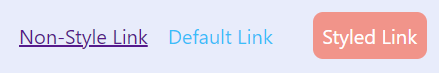
5. third-party componentにstyled-componentsを適用
styled メソッドは、自作のコンポーネントやthird-partyコンポーネントに対しても完璧に動作します。third-partyコンポーネントに使用する場合は、className プロップをDOMコンポーネントに追加する必要があります。
import React,{ ReactNode } from 'react';
import styled from "styled-components";

const MainContainer = styled.section`
  width: 50%;
  height: 100%;
  padding: 0.5rem;
  margin: 2rem;
  background-color: #e8ecfb;
`;

interface LinkProps {
  className?: string;
  children: ReactNode;
  href?: string;
}

const Link = ({ className, children, href }: LinkProps) => (
  <a className={className} href={href}>
    {children}
  </a>
);

const DefaultLink = styled(Link)`
  color: #39bff9;
  margin: 1rem;
  text-decoration: none;
`;

const StyledLink = styled(DefaultLink)`
  color: #fff !important;
  background-color: #F1948A;
  border-radius: 0.5rem;
  padding: 0.5rem;
`;

function App() {
  return (
    <MainContainer>
      <Link href="<https://example.com>">Non-Style Link</Link>
      <DefaultLink href="<https://example1.com>">Default Link</DefaultLink>
      <StyledLink href="<https://example2.com>">Styled Link</StyledLink>
    </MainContainer>
  );
}

export default App;
出力結果
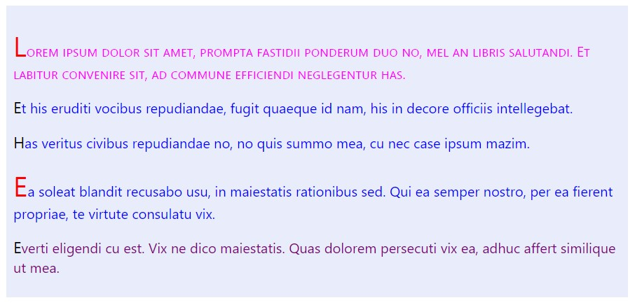
6. 疑似要素と疑似クラス、ネスト
(Pseudoelements, pseudoselectors, and nesting)
import React,{ ReactNode } from 'react';
import styled from "styled-components";

const MainContainer = styled.section`
  width: 50%;
  height: 100%;
  padding: 0.5rem;
  margin: 2rem;
  background-color: #e8ecfb;
`;

const PseudoDiv = styled.p.attrs((/* props */) => ({ tabIndex: 0 }))`
  color: blue;

  :first-child {
    color: #FF00FF;
    font-variant: small-caps;
  }

  :last-child {
    color: #800080;
  }

  :first-letter {
    color: #000000;
    font-size: large;
  }

  .intro {
    &::first-letter {
      font-size: xx-large;
      color: #ff0000;
    }
  }
`;

function StyledComponentsExample() {
  return (
    <MainContainer>
      <PseudoDiv>
        <p className = "intro">Lorem ipsum dolor sit amet, prompta fastidii ponderum duo no, mel an libris salutandi. Et labitur convenire sit, ad commune efficiendi neglegentur has. </p>
        <p>Et his eruditi vocibus repudiandae, fugit quaeque id nam, his in decore officiis intellegebat. </p>
        <p>Has veritus civibus repudiandae no, no quis summo mea, cu nec case ipsum mazim.</p>
        <p className = "intro">Ea soleat blandit recusabo usu, in maiestatis rationibus sed. Qui ea semper nostro, per ea fierent propriae, te virtute consulatu vix.</p>
        <p>Everti eligendi cu est. Vix ne dico maiestatis. Quas dolorem persecuti vix ea, adhuc affert similique ut mea.</p>
      </PseudoDiv>
    </MainContainer>
  );
}

export default StyledComponentsExample;
出力結果
7. Styled-componentsでアニメーションを行う
CSSアニメーションを行うために、keyframesコンポネントを使用します。
import React,{ ReactNode } from 'react';
import styled, { keyframes } from "styled-components";

const MainContainer = styled.section`
  width: 50%;
  height: 100%;
  padding: 0.5rem;
  margin: 2rem;
  background-color: #e8ecfb;
`;

const bounce = keyframes`
  0%, 100% {
    transform: translateY(0);
  }
  50% {
    transform: translateY(-25px);
  }
`;

const BouncingRocket = styled.div`
  display: inline-block;
  animation: ${bounce} 1s linear infinite;
  font-size: 3rem;
  padding: 2rem 1rem;
  margin:0px 0px 0px 50px;
`;

function StyledComponentsExample() {
  return (
    <MainContainer>
      <BouncingRocket> 🚀 </BouncingRocket>
    </MainContainer>
  );
}

export default StyledComponentsExample;
OUTPUT