MUI DataGridとは?
MUI DataGrid(MUIデータグリッド)は、Reactアプリケーションで使用できるMaterial-UI(MUI)ライブラリのデータグリッドコンポーネントです。
Material-UIは、GoogleのMaterial Designガイドラインに基づいたUIコンポーネントを提供する人気のあるオープンソースのUIフレームワークです。
MUI DataGridは、表形式のデータを表示および操作するために設計されており、ユーザーフレンドリーで視覚的に魅力的な方法でデータを表示できます。
通常、データテーブル、スプレッドシート、情報のグリッドなど、タブルデータを扱うために使用されます。
ドキュメント
https://mui.com/x/react-data-grid/
プロパティ
DataGridは、さまざまなプロップを使用してカスタマイズや機能拡張ができます。
以下では、DataGridのスタイルや機能を強化するのに一般的に使用されるいくつかのプロップを紹介します。
DataGridプロパティ
タイプ | デフォルト値 | 説明 | |
|---|---|---|---|
rows [REQUIRED] | Array <object> | GridRowsProp 型の行セット | |
columns [REQUIRED] | Array | GridColDef[] 型の列セット | |
autoHeight | bool | true の場合、グリッドの高さは動的で、グリッド内の行数に従います。 | |
checkboxSelection | bool | true の場合、グリッドに行を選択するためのチェックボックスを持つ最初の列が表示されます。 | |
disableColumn- Selector | bool | true の場合、列の表示/非表示切り替えが無効になります。 | |
disableRow- SelectionOnClick | bool | true の場合、行またはセルをクリックしての選択が無効になります。 | |
pagination | pagination | デフォルトでは、グリッドフッターにレンダリングされるページネーションコンポーネントです。 | |
pageSizeOptions | Array <number> | { label: string, value: number } | [25, 50, 100] |
onRowClick | func | 行がクリックされたときに発生するコールバックです。 組み込みの列によって追加された対話型要素をクリックした場合は呼び出されません。 function(params: GridRowParams, event: MuiEvent, details: GridCallbackDetails) => void params GridRowParamsのすべてのプロパティを持っています。 event イベントオブジェクトです。 details このコールバックの追加の詳細情報です。 | |
initialState | object | DataGridの初期状態です。 初期化時にその中のデータが状態に設定されますが、制御されません。 initialStateのデータの一部が制御されている場合、制御状態が優先されます。 |
これらは、DataGridコンポーネントをカスタマイズおよび拡張するための数多くのプロップの一部です。より多くのプロップとその詳細な使用方法を探索したい場合は、
公式 MUI DataGrid ドキュメントーDataGrid APIを参照してください。
DataGridのスタイル設定、ページネーション、ソート、フィルタリング、カスタム動作の追加など、目的の機能を実現するための幅広いプロップが用意されています。
GridColDefプロパティ
タイプ | デフォルト値 | 説明 | |
|---|---|---|---|
field | string | 列識別子 GridRowModelの値とマッピングするために使用されます。 | |
headerName | string | コラムのヘッダーセルに表示されるコラム名 | |
width | number | 100 | 列の幅 |
flex | number | 設定された場合、列が可変幅を持つことを示します。範囲 [0, ∞)。 | |
minWidth | number | 50 | 列の最小幅 |
maxWidth | number | Infinity | 列の最大幅 |
sortable | boolean | true | 列はソート可能化 |
filterable | boolean | true | 列のフィルタリング可能化 |
disableExport | boolean | false | この列はエクスポートに含まれません。 |
valueGetter | (params: GridValueGetterParams <R, any>) => V | セル内の表示に、フィールドではなく特定のデータを取得するための関数 | |
renderCell | (params: GridRenderCellParams <R, V, F>) => React.ReactNode | この列のセルとしてレンダリングされるコンポーネントをオーバーライドする |
これらは、DataGrid の列 (GridColDef) をカスタマイズするための一般的なプロパティです。
特定のプロパティを設定することで、データグリッドの見た目と機能をカスタマイズできます。
詳細な使用方法については、公式 MUI DataGrid ドキュメントーGridColDef Interfaceを参照してください。
DataGrid の GridColDef プロパティを適切に設定することで、データの表示、ソート、フィルタリングなどをカスタマイズし、目的のデータテーブルを作成できます。
インストレーション
# npmを使用する場合
npm install @mui/x-data-grid
npm install @mui/material @emotion/react @emotion/styled

# yarnを使用する場合
yarn add @mui/x-data-grid
yarn add @mui/material @emotion/react @emotion/styled
実装
基本的な記述方法
import React from 'react'
import {
  DataGrid,
  GridColDef,
  GridRowsProp,
 } from '@mui/x-data-grid'

const rows: GridRowsProp = [
  { id: 1, col1: 'John', col2: 'Smith1', col3: 'john@gmail.com', col4: '070-1234-5678', col5: '01/11/1997', col6: 'Male'},
  { id: 2, col1: 'Jones', col2: 'Taylor', col3: 'jones@gmail.com', col4: '070-2234-5678', col5: '04/09/1992', col6: 'Female'},
  { id: 3, col1: 'Hellen', col2: 'Taylor', col3: 'hellen@gmail.com', col4: '070-3234-5678', col5: '11/06/1990', col6: 'Female'},
  { id: 4, col1: 'Anthony', col2: 'Mark', col3: 'anthony@gmail.com', col4: '070-4234-5678', col5: '07/07/1993', col6: 'Male'},
  { id: 5, col1: 'Mary', col2: 'Linh', col3: 'mary@gmail.com', col4: '070-5234-5678', col5: '01/05/1995', col6: 'Female'},
  { id: 6, col1: 'Simon', col2: 'Robert', col3: 'simon@gmail.com', col4: '070-6234-5678', col5: '30/05/2000', col6: 'Male'},
  { id: 7, col1: 'Jessica', col2: 'James', col3: 'jessica@gmail.com', col4: '070-7234-5678', col5: '01/12/1989', col6: 'Female'},
  { id: 8, col1: 'Charles', col2: 'Jonhston', col3: 'charles@gmail.com', col4: '070-8234-5678', col5: '08/08/1990', col6: 'Male'},
  { id: 9, col1: 'Linda', col2: 'Jonhson', col3: 'linda@gmail.com', col4: '070-9234-5678', col5: '04/03/1991', col6: 'Female'},
  { id: 10, col1: 'David', col2: 'Hawk', col3: 'david@gmail.com', col4: '070-0234-5678', col5: '11/12/1987', col6: 'Male'},
];

const columns: GridColDef[] = [
  { field: 'col1', headerName: 'First Name', minWidth: 150 },
  { field: 'col2', headerName: 'Last Name', minWidth: 150 },
  { field: 'col3', headerName: 'Email Address', minWidth: 150 },
  { field: 'col4', headerName: 'Phone No', minWidth: 150 },
  { field: 'col5', headerName: 'Date of Birth', minWidth: 150 },
  { field: 'col6', headerName: 'Gender', minWidth: 150 },
];

function MuiDataGrid() {
  return (
      <DataGrid rows={rows} columns={columns} autoHeight/>
  );
}

export default MuiDataGrid;
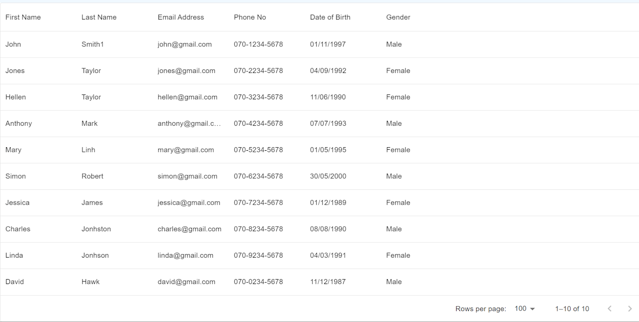
結果
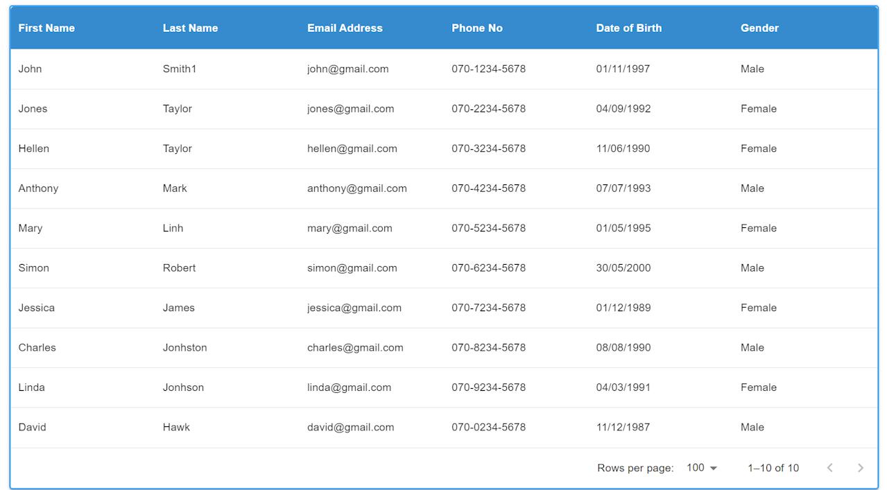
DataGridにスタイルを適用する
データグリッド(DataGrid)にスタイルを適用する方法には、CSS外部ファイルやインラインスタイルを使用できますが、
このガイドではstyled-componentsを使ってデータグリッドにスタイルを適用する方法を説明します。
※※styled-componentsの詳細については、こちらをご参照ください。
※※MuiDatagrid cssは公式ドキュメントMuiDatagrid CSSをご参考ください。
/* import,... */

const GridContainer = styled.div`
    display: flex;
    align-items: flex-end;
    margin: 64px;
    height: auto;
    width: auto;

    @media screen and (max-width: 1000px){
        margin-top: 40px;
    }
`
const CustomDataGrid = styled(DataGrid)`
  height: auto;
  width: auto;

  .MuiDataGrid-columnHeaderTitle{
    color: white;
    font-weight:700;
  }
  .MuiDataGrid-columnHeadersInner {
    background-color: #368bcf;
  }
`;

const rows: GridRowsProp = [
	/*rows*/
];

const columns: GridColDef[] = [
  /*columns*/
];

function MuiDataGrid() {
  return (
    <GridContainer>
      <CustomDataGrid
        sx={{
          boxShadow: 2,
          border: 2,
          borderColor: 'primary.light',
          '& .MuiDataGrid-cell:hover': {
            color: 'primary.main',
          },
        }}
        rows={rows}
        columns={columns}
        autoHeight
      />
    </GridContainer>
  );
}

export default MuiDataGrid;
結果
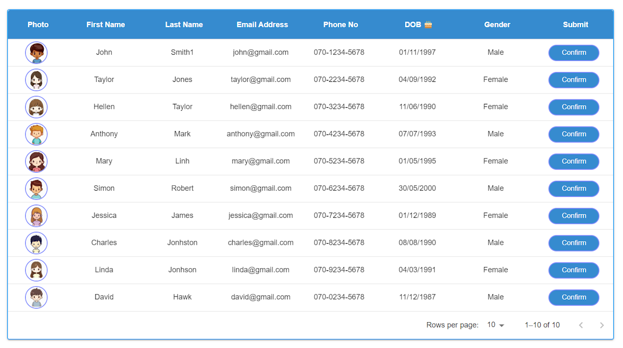
Propsを使ってDataGridを作成
ここでは、Material-UIのDataGridを使用してユーザー一覧を表示し、さまざまな機能をカスタマイズする方法を紹介します。
以下では、コードの各部分にコメントを追加し、DataGridの作成、ページネーションの設定、初期設定、列ごとのソートの有効化/無効化、renderHeader()とrenderCell()の使用法、
ボタンクリックイベントで選択した行のデータの取得、選択したデータのDialogへの表示など、さまざまな側面を説明しています。
import React, { useState } from 'react'
import styled from 'styled-components/macro'
import {
DataGrid,
GridColDef,
GridRowsProp,
} from '@mui/x-data-grid'
import Button from '@mui/material/Button';
import Dialog from '@mui/material/Dialog';
import DialogActions from '@mui/material/DialogActions';
import DialogContent from '@mui/material/DialogContent';
import DialogContentText from '@mui/material/DialogContentText';
import DialogTitle from '@mui/material/DialogTitle';
import John from '../assets/images/John.png';
import Taylor from '../assets/images/Taylor.png';
import Hellen from '../assets/images/Hellen.png';
import Anthony from '../assets/images/Anthony.png';
import Mary from '../assets/images/Mary.png';
import Simon from '../assets/images/Simon.png';
import Jessica from '../assets/images/Jessica.png';
import Charles from '../assets/images/Charles.png';
import Linda from '../assets/images/Linda.png';
import David from '../assets/images/David.png';
const HeaderStyles = `
color: white;
font-weight: 700;
`
const GridContainer = styled.div`
display: flex;
align-items: flex-end;
margin: 64px;
height: auto;
width: auto;
`
const CustomDataGrid = styled(DataGrid)`
height: auto;
width: auto;
.MuiDataGrid-columnHeaderTitle{
${HeaderStyles}
}
.MuiDataGrid-columnHeadersInner {
background-color: #368bcf;
}
.MuiDataGrid-cell {
padding: 8px !important;
}
.MuiDataGrid-cell:focus, .MuiDataGrid-cell:focus-within {
outline: none !important;
}
`
const MuiDataGridColumnHeaderDOB = styled.div`
${HeaderStyles}
`
const ImgDiv = styled.img`
width: 40px;
height: 40px;
border: 2px solid #7e89fd;
border-radius: 50%;
background-color: #f0f0f0;
`
const ButtonArea = styled.div`
display: flex;
gap: 8px;
flex-wrap: wrap;
font-weight: 400;
text-decoration: none;
border: none;
}
`
const ConfirmButton = styled.button`
color: white;
padding: 6px 24px;
border: 2px solid #7e89fd;
background-color: #368bcf;
border-radius: 50px;
transition: .3s;
text-decoration: none;
display: inline-block;
-webkit-appearance: none;
`
function MuiDataGrid() {
// データグリッド内の行の型を定義するインターフェース
interface GridRow {
id: number;
photo: string | JSX.Element;
firstName: string;
lastName: string;
mailAddress: string;
phoneNo: string;
dob: string;
gender: string;
submit: string | JSX.Element;
}
// ダイアログ表示の状態を管理するための状態変数
const [open, setOpen] = useState(false);
// 選択された行を管理するための状態変数
const [selectedRow, setSelectedRow] = useState(0);
// 画像のパス情報を保持する配列
const imagePaths = [
{ name: 'John', path: John },
{ name: 'Taylor', path: Taylor },
{ name: 'Hellen', path: Hellen },
{ name: 'Anthony', path: Anthony },
{ name: 'Mary', path: Mary },
{ name: 'Simon', path: Simon },
{ name: 'Jessica', path: Jessica },
{ name: 'Charles', path: Charles },
{ name: 'Linda', path: Linda },
{ name: 'David', path: David },
];
// データグリッドの行データを定義する配列
const rows: GridRowsProp = [
{ id: 1, photo: 'John.png', firstName: 'John', lastName: 'Smith1', mailAddress: 'john@gmail.com', phoneNo: '070-1234-5678', dob: '01/11/1997', gender: 'Male', submit: 'button'},
{ id: 2, photo: 'Taylor.png', firstName: 'Taylor', lastName: 'Jones', mailAddress: 'taylor@gmail.com', phoneNo: '070-2234-5678', dob: '04/09/1992', gender: 'Female', submit: 'button'},
{ id: 3, photo: 'Hellen.png', firstName: 'Hellen', lastName: 'Taylor', mailAddress: 'hellen@gmail.com', phoneNo: '070-3234-5678', dob: '11/06/1990', gender: 'Female', submit: 'button'},
{ id: 4, photo: 'Anthony.png', firstName: 'Anthony', lastName: 'Mark', mailAddress: 'anthony@gmail.com', phoneNo: '070-4234-5678', dob: '07/07/1993', gender: 'Male', submit: 'button'},
{ id: 5, photo: 'Mary.png', firstName: 'Mary', lastName: 'Linh', mailAddress: 'mary@gmail.com', phoneNo: '070-5234-5678', dob: '01/05/1995', gender: 'Female', submit: 'button'},
{ id: 6, photo: 'Simon.png', firstName: 'Simon', lastName: 'Robert', mailAddress: 'simon@gmail.com', phoneNo: '070-6234-5678', dob: '30/05/2000', gender: 'Male', submit: 'button'},
{ id: 7, photo: 'Jessica.png', firstName: 'Jessica', lastName: 'James', mailAddress: 'jessica@gmail.com', phoneNo: '070-7234-5678', dob: '01/12/1989', gender: 'Female', submit: 'button'},
{ id: 8, photo: 'Charles.png', firstName: 'Charles', lastName: 'Jonhston', mailAddress: 'charles@gmail.com', phoneNo: '070-8234-5678', dob: '08/08/1990', gender: 'Male', submit: 'button'},
{ id: 9, photo: 'Linda.png', firstName: 'Linda', lastName: 'Jonhson', mailAddress: 'linda@gmail.com', phoneNo: '070-9234-5678', dob: '04/03/1991', gender: 'Female', submit: 'button'},
{ id: 10, photo: 'David.png', firstName: 'David', lastName: 'Hawk', mailAddress: 'david@gmail.com', phoneNo: '070-0234-5678', dob: '11/12/1987', gender: 'Male', submit: 'button'},
];
// データグリッドの列の定義
const columns: GridColDef[] = [
{
field: 'photo',
headerName: 'Photo',
headerAlign: 'center',
align: 'center',
minWidth: 100,
sortable: false,
flex:1,
renderCell: (params) => {
const photoName = params.row.photo.split(".")[0];
const imgPath = imagePaths.find((img) => img.name === photoName)?.path;
return (
<ImgDiv src={imgPath} alt={photoName} />
);
}
},
{
field: 'firstName',
headerName: 'First Name',
headerAlign: 'center',
align: 'center',
minWidth: 150,
flex:1
},
{
field: 'lastName',
headerName: 'Last Name',
headerAlign: 'center',
align: 'center',
minWidth: 150, flex:1
},
{
field: 'mailAddress',
headerName: 'Email Address',
headerAlign: 'center',
align: 'center',
minWidth: 150,
flex:1
},
{
field: 'phoneNo',
headerName: 'Phone No',
headerAlign: 'center',
align: 'center',
minWidth: 150,
sortable: false,
flex:1
},
{
field: 'dob',
headerName: 'Date of Birth',
headerAlign: 'center',
align: 'center',
minWidth: 150,
flex:1,
renderHeader: () => (
<MuiDataGridColumnHeaderDOB>
DOB 🎂
</MuiDataGridColumnHeaderDOB>
),
},
{
field: 'gender',
headerName: 'Gender',
headerAlign: 'center',
align: 'center',
minWidth: 150,
flex:1
},
{
field: 'submit',
headerName: 'Submit',
headerAlign: 'center',
align: 'center',
minWidth: 150,
sortable: false,
flex:1,
renderCell: (params) => (
<ButtonArea>
{params.value === 'button' ? (
<ConfirmButton onClick={() => handleButtonClick(params.row)}>Confirm</ConfirmButton>
) : (
params.value
)}
</ButtonArea>
),
},
];
// ダイアログを開くための関数
const handleOpen = () => {
setOpen(true);
};
// ダイアログを閉じるための関数
const handleClose = () => {
setOpen(false);
};
// Confirmボタンがクリックされた際に、選択された行の詳細情報を表示するための関数
const handleButtonClick = (row: GridRow) => {
const selectedId: number = row['id'] as number;
//選択した行をセット
setSelectedRow(selectedId);
//ダイアログを開くための関数を呼び出す
handleOpen();
};
//選択した行の詳細データを取得
const renderRowDetails = (selectedRow: number) => {
const photoName = rows.find((row) => row.id === selectedRow)?.photo;
const imgPath = imagePaths.find((img) => img.name === photoName.split(".")[0])?.path;
return (
<div>
<img
src={imgPath}
alt={rows.find((row) => row.id === selectedRow)?.photo}
style={{ maxWidth: '75%', height: 'auto'}}
/>
<DialogContentText>
<strong>First Name:</strong> {rows.find((row) => row.id === selectedRow)?.firstName}<br />
<strong>Last Name:</strong> {rows.find((row) => row.id === selectedRow)?.lastName}<br />
<strong>Email Address:</strong> {rows.find((row) => row.id === selectedRow)?.mailAddress}<br />
<strong>Phone No:</strong> {rows.find((row) => row.id === selectedRow)?.phoneNo}<br />
<strong>Date of Birth:</strong> {rows.find((row) => row.id === selectedRow)?.dob}<br />
<strong>Gender:</strong> {rows.find((row) => row.id === selectedRow)?.gender}<br />
</DialogContentText>
</div>
);
};
return (
<GridContainer>
<CustomDataGrid
//システムオーバーライドと追加のCSSスタイルを定義できるシステムプロ
sx={{
boxShadow: 2,
border: 2,
borderColor: 'primary.light',
'& .MuiDataGrid-cell:hover': {
color: 'primary.main',
},
}}
//行セット
rows={rows}
//列セット
columns={columns}
//グリッドの高さは動的で、グリッド内の行数に従い
autoHeight
//コンポーネントのUIを使用してpageSizeを動的に選択
pageSizeOptions={[5, 10, 15, 20]}
//初期設定
initialState={{
pagination: {
paginationModel: { page: 0, pageSize: 5 },
},
}}
//行選択モードを無効化
rowSelection={false}
/>
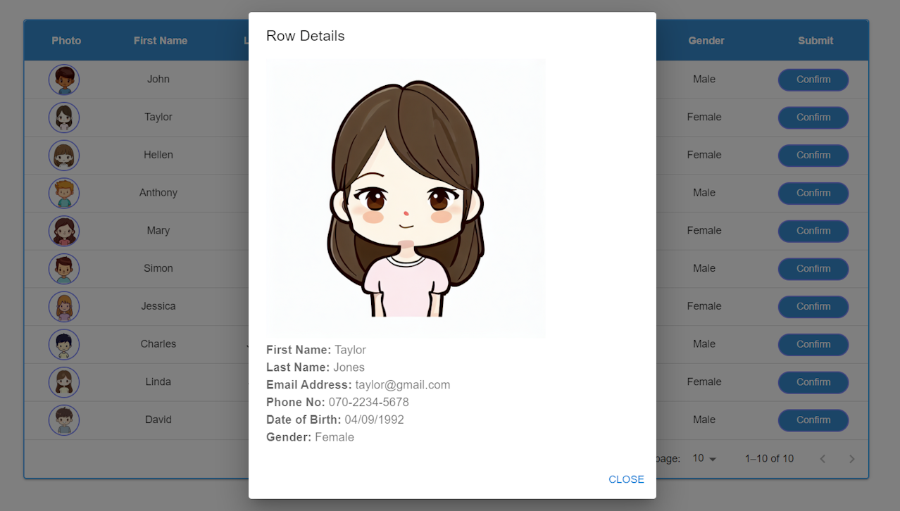
{/* ダイアログコンポーネント */}
<Dialog open={open} onClose={handleClose}>
<DialogTitle>Row Details</DialogTitle>
<DialogContent>
{selectedRow && renderRowDetails(selectedRow)}
</DialogContent>
<DialogActions>
<Button onClick={handleClose} color="primary">
Close
</Button>
</DialogActions>
</Dialog>
</GridContainer>
);
}
export default MuiDataGrid;
結果
「Confirm」ボタンをクリックすると、dialogが出てきます!