この記事では、Reactを使用して、Material-UI DataGridコンポーネントを活用してCSVデータのエクスポート方法について詳しく説明します。
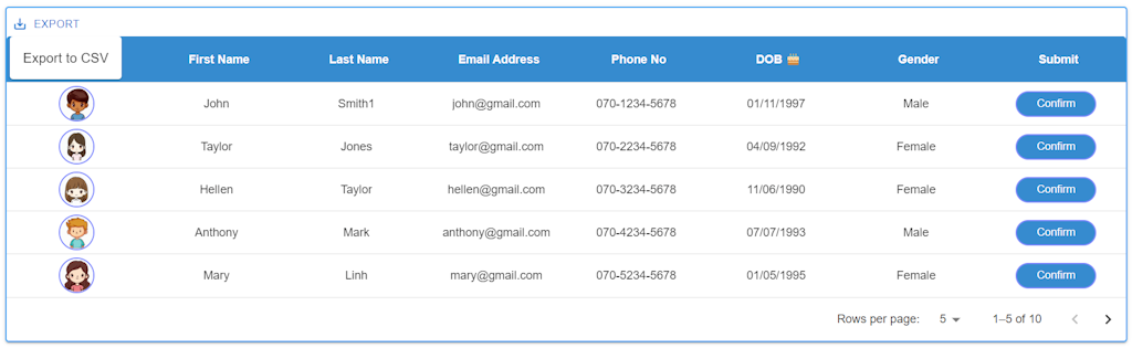
グリッドの作成
まず、CSVデータをエクスポートする前に、Material-UI DataGridを作成する必要があります。
以下は、DataGridを作成するためのコード例です。
※Gridを作成する手順については、こちらを参照してください
import React, { useState } from 'react'
import styled from 'styled-components/macro'
import {
  DataGrid,
  GridColDef,
  GridRowsProp,
 } from '@mui/x-data-grid'

import Button from '@mui/material/Button';
import Dialog from '@mui/material/Dialog';
import DialogActions from '@mui/material/DialogActions';
import DialogContent from '@mui/material/DialogContent';
import DialogContentText from '@mui/material/DialogContentText';
import DialogTitle from '@mui/material/DialogTitle';

import John from '../assets/images/John.png';
import Taylor from '../assets/images/Taylor.png';
import Hellen from '../assets/images/Hellen.png';
import Anthony from '../assets/images/Anthony.png';
import Mary from '../assets/images/Mary.png';
import Simon from '../assets/images/Simon.png';
import Jessica from '../assets/images/Jessica.png';
import Charles from '../assets/images/Charles.png';
import Linda from '../assets/images/Linda.png';
import David from '../assets/images/David.png';

const HeaderStyles = `
  color: white;
  font-weight: 700;
`
const GridContainer = styled.div`
  display: flex;
  align-items: flex-end;
  margin: 64px;
  height: auto;
  width: auto;
`
const CustomDataGrid = styled(DataGrid)`
  height: auto;
  width: auto;

  .MuiDataGrid-columnHeaderTitle{
    ${HeaderStyles}
  }
  .MuiDataGrid-columnHeadersInner {
    background-color: #368bcf;
  }
  .MuiDataGrid-cell {
    padding: 8px !important;
  }
  .MuiDataGrid-cell:focus, .MuiDataGrid-cell:focus-within {
    outline: none !important;
  }
`
const MuiDataGridColumnHeaderDOB = styled.div`
  ${HeaderStyles}
`
const ImgDiv = styled.img`
  width: 40px;
  height: 40px;
  border: 2px solid #7e89fd;
  border-radius: 50%;
  background-color: #f0f0f0;
`
const ButtonArea = styled.div`
  display: flex;
  gap: 8px;
  flex-wrap: wrap;
  font-weight: 400;
  text-decoration: none;
  border: none;
}
`
const ConfirmButton = styled.button`
  color: white;
  padding: 6px 24px;
  border: 2px solid #7e89fd;
  background-color: #368bcf;
  border-radius: 50px;
  transition: .3s;
  text-decoration: none;
  display: inline-block;
  -webkit-appearance: none;
`

function MuiDataGrid() {

  // データグリッド内の行の型を定義するインターフェース
  interface GridRow {
    id: number;
    photo: string | JSX.Element;
    firstName: string;
    lastName: string;
    mailAddress: string;
    phoneNo: string;
    dob: string;
    gender: string;
    submit: string | JSX.Element;
  }

  // ダイアログ表示の状態を管理するための状態変数
  const [open, setOpen] = useState(false);

  // 選択された行を管理するための状態変数
  const [selectedRow, setSelectedRow] = useState(0);

  // 画像のパス情報を保持する配列
  const imagePaths = [
    { name: 'John', path: John },
    { name: 'Taylor', path: Taylor },
    { name: 'Hellen', path: Hellen },
    { name: 'Anthony', path: Anthony },
    { name: 'Mary', path: Mary },
    { name: 'Simon', path: Simon },
    { name: 'Jessica', path: Jessica },
    { name: 'Charles', path: Charles },
    { name: 'Linda', path: Linda },
    { name: 'David', path: David },
  ];

  // データグリッドの行データを定義する配列
  const rows: GridRowsProp = [
    { id: 1, photo: 'John.png', firstName: 'John', lastName: 'Smith1', mailAddress: 'john@gmail.com', phoneNo: '070-1234-5678', dob: '01/11/1997', gender: 'Male', submit: 'button'},
    { id: 2, photo: 'Taylor.png', firstName: 'Taylor', lastName: 'Jones', mailAddress: 'taylor@gmail.com', phoneNo: '070-2234-5678', dob: '04/09/1992', gender: 'Female', submit: 'button'},
    { id: 3, photo: 'Hellen.png', firstName: 'Hellen', lastName: 'Taylor', mailAddress: 'hellen@gmail.com', phoneNo: '070-3234-5678', dob: '11/06/1990', gender: 'Female', submit: 'button'},
    { id: 4, photo: 'Anthony.png', firstName: 'Anthony', lastName: 'Mark', mailAddress: 'anthony@gmail.com', phoneNo: '070-4234-5678', dob: '07/07/1993', gender: 'Male', submit: 'button'},
    { id: 5, photo: 'Mary.png', firstName: 'Mary', lastName: 'Linh', mailAddress: 'mary@gmail.com', phoneNo: '070-5234-5678', dob: '01/05/1995', gender: 'Female', submit: 'button'},
    { id: 6, photo: 'Simon.png', firstName: 'Simon', lastName: 'Robert', mailAddress: 'simon@gmail.com', phoneNo: '070-6234-5678', dob: '30/05/2000', gender: 'Male', submit: 'button'},
    { id: 7, photo: 'Jessica.png', firstName: 'Jessica', lastName: 'James', mailAddress: 'jessica@gmail.com', phoneNo: '070-7234-5678', dob: '01/12/1989', gender: 'Female', submit: 'button'},
    { id: 8, photo: 'Charles.png', firstName: 'Charles', lastName: 'Jonhston', mailAddress: 'charles@gmail.com', phoneNo: '070-8234-5678', dob: '08/08/1990', gender: 'Male', submit: 'button'},
    { id: 9, photo: 'Linda.png', firstName: 'Linda', lastName: 'Jonhson', mailAddress: 'linda@gmail.com', phoneNo: '070-9234-5678', dob: '04/03/1991', gender: 'Female', submit: 'button'},
    { id: 10, photo: 'David.png', firstName: 'David', lastName: 'Hawk', mailAddress: 'david@gmail.com', phoneNo: '070-0234-5678', dob: '11/12/1987', gender: 'Male', submit: 'button'},
  ];

  // データグリッドの列の定義
  const columns: GridColDef[] = [
    {
      field: 'photo',
      headerName: 'Photo',
      headerAlign: 'center',
      align: 'center',
      minWidth: 100,
      sortable: false,
      flex:1,
      renderCell: (params) => {
        const photoName = params.row.photo.split(".")[0];
        const imgPath = imagePaths.find((img) => img.name === photoName)?.path;
        return (
          <ImgDiv src={imgPath} alt={photoName} />
        );
      }
    },
    {
      field: 'firstName',
      headerName: 'First Name',
      headerAlign: 'center',
      align: 'center',
      minWidth: 150,
      flex:1
    },
    {
      field: 'lastName',
      headerName: 'Last Name',
      headerAlign: 'center',
      align: 'center',
      minWidth: 150, flex:1
    },
    {
      field: 'mailAddress',
      headerName: 'Email Address',
      headerAlign: 'center',
      align: 'center',
      minWidth: 150,
      flex:1
    },
    {
      field: 'phoneNo',
      headerName: 'Phone No',
      headerAlign: 'center',
      align: 'center',
      minWidth: 150,
      sortable: false,
      flex:1
    },
    {
      field: 'dob',
      headerName: 'Date of Birth',
      headerAlign: 'center',
      align: 'center',
      minWidth: 150,
      flex:1,
      renderHeader: () => (
        <MuiDataGridColumnHeaderDOB>
          DOB 🎂
        </MuiDataGridColumnHeaderDOB>
      ),
    },
    {
      field: 'gender',
      headerName: 'Gender',
      headerAlign: 'center',
      align: 'center',
      minWidth: 150,
      flex:1
    },
    {
      field: 'submit',
      headerName: 'Submit',
      headerAlign: 'center',
      align: 'center',
      minWidth: 150,
      sortable: false,
      flex:1,
      renderCell: (params) => (
        <ButtonArea>
           {params.value === 'button' ? (
               <ConfirmButton onClick={() => handleButtonClick(params.row)}>Confirm</ConfirmButton>
           ) : (
               params.value
           )}
        </ButtonArea>
      ),
    },
  ];

  // モーダルを開くための関数
  const handleOpen = () => {
    setOpen(true);
  };

  //  モーダルを閉じるための関数
  const handleClose = () => {
    setOpen(false);
  };

  // Confirmボタンがクリックされた際に、選択された行の詳細情報を表示するための関数
  const handleButtonClick = (row: GridRow) => {
    const selectedId: number = row['id'] as number;
    //選択した行をセット
    setSelectedRow(selectedId);
    //モーダルを開くための関数を呼び出す
    handleOpen();
  };

  //選択した行の詳細データを取得
  const renderRowDetails = (selectedRow: number) => {
    const photoName = rows.find((row) => row.id === selectedRow)?.photo;
    const imgPath = imagePaths.find((img) => img.name === photoName.split(".")[0])?.path;
    return (
      <div>
        <img
          src={imgPath}
          alt={rows.find((row) => row.id === selectedRow)?.photo}
          style={{ maxWidth: '75%', height: 'auto'}}
        />
        <DialogContentText>
          <strong>First Name:</strong> {rows.find((row) => row.id === selectedRow)?.firstName}<br />
          <strong>Last Name:</strong> {rows.find((row) => row.id === selectedRow)?.lastName}<br />
          <strong>Email Address:</strong> {rows.find((row) => row.id === selectedRow)?.mailAddress}<br />
          <strong>Phone No:</strong> {rows.find((row) => row.id === selectedRow)?.phoneNo}<br />
          <strong>Date of Birth:</strong> {rows.find((row) => row.id === selectedRow)?.dob}<br />
          <strong>Gender:</strong> {rows.find((row) => row.id === selectedRow)?.gender}<br />
        </DialogContentText>
      </div>
    );
  };

  return (
    <GridContainer>
      <CustomDataGrid
        //システムオーバーライドと追加のCSSスタイルを定義できるシステムプロ
        sx={{
          boxShadow: 2,
          border: 2,
          borderColor: 'primary.light',
          '& .MuiDataGrid-cell:hover': {
            color: 'primary.main',
          },
        }}
        //行セット
        rows={rows}
        //列セット
        columns={columns}
        //グリッドの高さは動的で、グリッド内の行数に従い
        autoHeight
        //コンポーネントのUIを使用してpageSizeを動的に選択
        pageSizeOptions={[5, 10, 15, 20]}
        //初期設定
        initialState={{
          pagination: {
            paginationModel: { page: 0, pageSize: 5 },
          },
        }}
        //行選択モードを無効化
        rowSelection={false}
      />
      {/* ダイアログコンポーネント */}
      <Dialog open={open} onClose={handleClose}>
        <DialogTitle>Row Details</DialogTitle>
        <DialogContent>
          {selectedRow && renderRowDetails(selectedRow)}
        </DialogContent>
        <DialogActions>
          <Button onClick={handleClose} color="primary">
            Close
          </Button>
        </DialogActions>
      </Dialog>
    </GridContainer>
  );
}

export default MuiDataGrid;
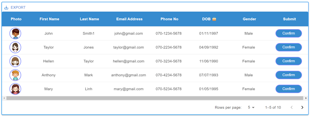
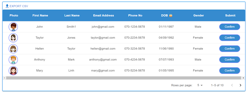
CSVデータのエクスポートツール (Export Tool - GridToolbar)
CSVデータをエクスポートするには、自前でカスタムのツールバーを作成することもできます。
しかし、Material-UI DataGridには、データを簡単にエクスポートするためのGridToolbarが用意されています。
このGridToolbarを活用することで、エクスポート作業が迅速かつ効率的に行えます。
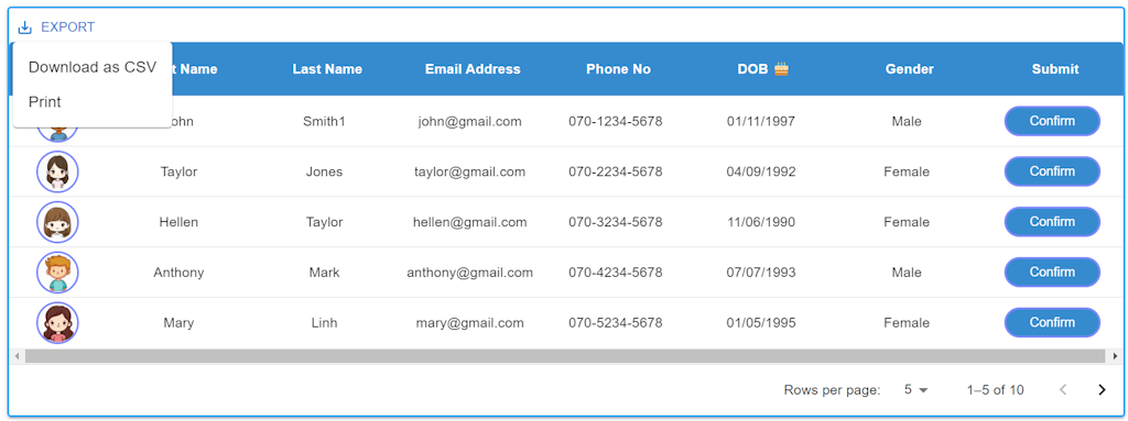
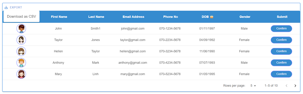
GridToolbarの説明
GridToolbarにはデフォルトで以下の4つの機能があります。
- COLUMNS:カラムの表示/非表示を切り替えるオプション
- FILTERS:フィルター機能を有効にするオプション
- DENSITY:行の高さを選択できるオプション(Compact, Standard, Comfortable)
- EXPORT:データのエクスポートオプション
※MUI DataGridはCSVエクスポートだけでなく、プリントおよびExcelエクスポートも可能です。
GridToolbarの使い方
GridToolbarを活用してデータのエクスポートを行う際の具体的な手順を説明します。以下は、GridToolbarをDataGridに追加する方法です
import {
  DataGrid,
  GridColDef,
  GridRowsProp,
  GridToolbar,
} from "@mui/x-data-grid"
// ...
<DataGrid {...data} loading={loading} slots={{ toolbar: GridToolbar }} />
デフォルトのツールバーには、全ての機能が表示されます。
これにより、データのエクスポートや他の機能を素早く活用できます。

カスタムツールバーの作成方法
MUI DataGridには、独自のツールバーコンポーネントを作成し、カスタムツールバーを構築できる独立したコンポーネントが用意されています。以下の表に、各機能に対応するコンポーネントとその使い方を示します。
機能 (Features) | コンポーネント (Components) |
|---|---|
カラム (COLUMNS) | GridToolbarColumnsButton |
フィルター (FILTERS) | GridToolbarFilterButton |
密度 (DENSITY) | GridToolbarDensitySelector |
エクスポート (EXPORT) | GridToolbarExport |
カスタムツールバーを作成する場合、以下のようにコンポーネントを組み合わせて使用します。
import {
  DataGrid,
  GridColDef,
  GridRowsProp,
  GridToolbar,
  GridToolbarContainer,
  GridToolbarExport,
  GridToolbarColumnsButton,
  GridToolbarFilterButton,
  GridToolbarDensitySelector,
} from "@mui/x-data-grid"
// ...
function CustomToolbar() {
    return (
      <GridToolbarContainer>
        {/*
	  //カラムの表示/非表示ボタン
	  <GridToolbarColumnsButton />
	  //フィルター機能ボタン
	  <GridToolbarFilterButton />
       //行の密度選択ボタン
	   <GridToolbarDensitySelector />
        */}
     //データのエクスポートボタン
        <GridToolbarExport />
      </GridToolbarContainer>
    );
  }
//...
<DataGrid {...data} loading={loading} slots={{ toolbar: CustomToolbar}} />
これにより、定義した機能を含むカスタムツールバーが表示されます。
GridToolbarExport
GridToolbarExportには、データをエクスポートする際に使用する2つのオプションが含まれています。
(1) GridToolbarExport Optionsの説明
- printOptions:テキストファイルをエクスポートする際に使用します。
- csvOptions:CSVファイルをエクスポートする際に使用します。
(2) オプションの有効/無効の設定
GridToolbarExportはデフォルトで両方のオプションを表示しますが、各オプションを有効または無効に設定することができます。
- csv exportを無効にしたい場合
function CustomToolbar() { return ( <GridToolbarContainer> <GridToolbarExport csvOptions={{ disableToolbarButton: true }} /> </GridToolbarContainer> ); } - printを無効にしたい場合
function CustomToolbar() {
    return (
      <GridToolbarContainer>
        <GridToolbarExport printOptions={{ disableToolbarButton: true }} />
      </GridToolbarContainer>
    );
  }
(3) CSVエクスポートラベルの変更方法
CSVエクスポートのボタンラベルをカスタマイズする場合、DataGridのlocaleTextプロパティを使用してラベルを変更できます。例えば:
<DataGrid
 // CSVエクスポートボタンのラベルを変更
  localeText={{
    toolbarExportCSV: "Export to CSV",
  }}
  ・・...
  slots={{
    toolbar: CustomToolbar,
  }}
/>
これにより、CSVエクスポートボタンのラベルがカスタマイズされます。
(4) GridToolbarExportのメニューを無効にする方法
GridToolbarExportのメニューを無効にするために、カスタムのエクスポート機能を持つ独自のボタンを作成できます。
以下の例では、独自のボタンとエクスポート機能を組み合わせています。
import {
  DataGrid,
  GridColDef,
  GridRowsProp,
  GridToolbarContainer,
  GridCsvExportOptions,
  useGridApiContext,
} from "@mui/x-data-grid";
import { Button, ButtonProps } from "@mui/material";
import FileDownloadIcon from "@mui/icons-material/FileDownload";

//...

const CustomToolbar = (props: any) => {
    const apiRef = useGridApiContext();

    const handleExport = (options?: GridCsvExportOptions) =>
      apiRef.current.exportDataAsCsv(options);

    const buttonBaseProps: ButtonProps = {
      color: "primary",
      size: "small",
    };

    return (
      <div>
        <div style={{ marginRight: "auto" }}>
          <GridToolbarContainer>
            <Button {...buttonBaseProps} onClick={() => handleExport()}>
              <FileDownloadIcon /> Export CSV
            </Button>
          </GridToolbarContainer>
        </div>
      </div>
    );
  };

//...

<DataGrid {...data} slots={{ toolbar: CustomToolbar}} />
FileDownloadアイコンを使用するため、@mui/icons-materialをインストールする必要があります。まだインストールしていない場合、以下のコマンドでインストールできます。
npm install @mui/icons-material
この状態でエクスポートする場合、デフォルトで全部のカラムがエクスポートされます。
特定の列をエクスポートしたい場合、GridCsvExportOptions を使用します。
GridCsvExportOptions Interface
GridCsvExportOptions インターフェースはエクスポートオプションを設定するために使用されます。以下はプロパティー一覧です。
Name | Type | Default | Description |
|---|---|---|---|
allColumns? | boolean | false | trueの場合、非表示のカラムもエクスポートされます |
delimiter? | string | ',' | フィールドを区切るために使用される文字 |
fields? | string[] | エクスポートされるカラム,カラムのエクスポートを制限したい場合にのみ使用すべきです | |
fileName? | string | document .title | ファイル名として使用される文字列 |
getRowsToExport? | (params: GridCsvGetRows- ToExportParams) => GridRowId[] | エクスポートすべき順序でエクスポートする行のIDリストを返す関数 | |
includeColumn- GroupsHeaders? | boolean | true | trueの場合、CSVにカラムグループが含まれます |
includeHeaders? | boolean | true | trueの場合、CSVにはカラムヘッダーとカラムグループが含まれます。カラムグループが含まれるかどうかを制御するには、includeColumn GroupsHeadersを使用してください |
utf8WithBom? | boolean | false | trueの場合、UTF-8のバイトオーダーマーク(BOM)がエクスポートされたファイルの先頭に付加されます。これにより、ExcelがファイルエンコーディングをUTF-8として自動的に検出することができます。 |
MUI Datagrid CSVエクスポートをGridCsvExportOptionsを使用して実行
- fieldsでエクスポートする列のリストを定義
- fileNameでエクスポートファイル名を定義
- includeColumnGroupsHeaders:falseでグループヘーダをエクスポートしない
import React, { useState } from "react";
import styled from "styled-components/macro";
import {
DataGrid,
GridColDef,
GridRowsProp,
GridToolbarContainer,
GridCsvExportOptions,
useGridApiContext,
GridColumnGroupingModel,
} from "@mui/x-data-grid";
import { Button, ButtonProps } from "@mui/material";
import FileDownloadIcon from "@mui/icons-material/FileDownload";
import Dialog from "@mui/material/Dialog";
import DialogActions from "@mui/material/DialogActions";
import DialogContent from "@mui/material/DialogContent";
import DialogContentText from "@mui/material/DialogContentText";
import DialogTitle from "@mui/material/DialogTitle";
import John from "../assets/images/John.png";
import Taylor from "../assets/images/Taylor.png";
import Hellen from "../assets/images/Hellen.png";
import Anthony from "../assets/images/Anthony.png";
import Mary from "../assets/images/Mary.png";
import Simon from "../assets/images/Simon.png";
import Jessica from "../assets/images/Jessica.png";
import Charles from "../assets/images/Charles.png";
import Linda from "../assets/images/Linda.png";
import David from "../assets/images/David.png";
const HeaderStyles = `
color: white;
font-weight: 700;
`;
const GridContainer = styled.div`
display: flex;
align-items: flex-end;
margin: 64px;
height: auto;
width: auto;
`;
const CustomDataGrid = styled(DataGrid)`
height: auto;
width: auto;
.MuiDataGrid-columnHeaderTitle {
${HeaderStyles}
}
.MuiDataGrid-columnHeadersInner {
background-color: #368bcf;
}
.MuiDataGrid-cell {
padding: 8px !important;
}
.MuiDataGrid-cell:focus,
.MuiDataGrid-cell:focus-within {
outline: none !important;
}
`;
const MuiDataGridColumnHeaderDOB = styled.div`
${HeaderStyles}
`;
const ImgDiv = styled.img`
width: 40px;
height: 40px;
border: 2px solid #7e89fd;
border-radius: 50%;
background-color: #f0f0f0;
`;
const ButtonArea = styled.div`
display: flex;
gap: 8px;
flex-wrap: wrap;
font-weight: 400;
text-decoration: none;
border: none;
}
`;
const ConfirmButton = styled.button`
color: white;
padding: 6px 24px;
border: 2px solid #7e89fd;
background-color: #368bcf;
border-radius: 50px;
transition: 0.3s;
text-decoration: none;
display: inline-block;
-webkit-appearance: none;
`;
function MuiDataGrid() {
// データグリッド内の行の型を定義するインターフェース
interface GridRow {
id: number;
photo: string | JSX.Element;
firstName: string;
lastName: string;
mailAddress: string;
phoneNo: string;
dob: string;
gender: string;
submit: string | JSX.Element;
}
// ダイアログ表示の状態を管理するための状態変数
const [open, setOpen] = useState(false);
// 選択された行を管理するための状態変数
const [selectedRow, setSelectedRow] = useState(0);
// 画像のパス情報を保持する配列
const imagePaths = [
{ name: "John", path: John },
{ name: "Taylor", path: Taylor },
{ name: "Hellen", path: Hellen },
{ name: "Anthony", path: Anthony },
{ name: "Mary", path: Mary },
{ name: "Simon", path: Simon },
{ name: "Jessica", path: Jessica },
{ name: "Charles", path: Charles },
{ name: "Linda", path: Linda },
{ name: "David", path: David },
];
// データグリッドの行データを定義する配列
const rows: GridRowsProp = [
{
id: 1,
photo: "John.png",
firstName: "John",
lastName: "Smith1",
mailAddress: "john@gmail.com",
phoneNo: "070-1234-5678",
dob: "01/11/1997",
gender: "Male",
submit: "button",
},
{
id: 2,
photo: "Taylor.png",
firstName: "Taylor",
lastName: "Jones",
mailAddress: "taylor@gmail.com",
phoneNo: "070-2234-5678",
dob: "04/09/1992",
gender: "Female",
submit: "button",
},
{
id: 3,
photo: "Hellen.png",
firstName: "Hellen",
lastName: "Taylor",
mailAddress: "hellen@gmail.com",
phoneNo: "070-3234-5678",
dob: "11/06/1990",
gender: "Female",
submit: "button",
},
{
id: 4,
photo: "Anthony.png",
firstName: "Anthony",
lastName: "Mark",
mailAddress: "anthony@gmail.com",
phoneNo: "070-4234-5678",
dob: "07/07/1993",
gender: "Male",
submit: "button",
},
{
id: 5,
photo: "Mary.png",
firstName: "Mary",
lastName: "Linh",
mailAddress: "mary@gmail.com",
phoneNo: "070-5234-5678",
dob: "01/05/1995",
gender: "Female",
submit: "button",
},
{
id: 6,
photo: "Simon.png",
firstName: "Simon",
lastName: "Robert",
mailAddress: "simon@gmail.com",
phoneNo: "070-6234-5678",
dob: "30/05/2000",
gender: "Male",
submit: "button",
},
{
id: 7,
photo: "Jessica.png",
firstName: "Jessica",
lastName: "James",
mailAddress: "jessica@gmail.com",
phoneNo: "070-7234-5678",
dob: "01/12/1989",
gender: "Female",
submit: "button",
},
{
id: 8,
photo: "Charles.png",
firstName: "Charles",
lastName: "Jonhston",
mailAddress: "charles@gmail.com",
phoneNo: "070-8234-5678",
dob: "08/08/1990",
gender: "Male",
submit: "button",
},
{
id: 9,
photo: "Linda.png",
firstName: "Linda",
lastName: "Jonhson",
mailAddress: "linda@gmail.com",
phoneNo: "070-9234-5678",
dob: "04/03/1991",
gender: "Female",
submit: "button",
},
{
id: 10,
photo: "David.png",
firstName: "David",
lastName: "Hawk",
mailAddress: "david@gmail.com",
phoneNo: "070-0234-5678",
dob: "11/12/1987",
gender: "Male",
submit: "button",
},
];
// データグリッドの列の定義
const columns: GridColDef[] = [
{
field: "photo",
headerName: "Photo",
headerAlign: "center",
align: "center",
minWidth: 100,
sortable: false,
flex: 1,
renderCell: (params) => {
const photoName = params.row.photo.split(".")[0];
const imgPath = imagePaths.find((img) => img.name === photoName)?.path;
return <ImgDiv src={imgPath} alt={photoName} />;
},
},
{
field: "firstName",
headerName: "First Name",
headerAlign: "center",
align: "center",
minWidth: 150,
flex: 1,
},
{
field: "lastName",
headerName: "Last Name",
headerAlign: "center",
align: "center",
minWidth: 150,
flex: 1,
},
{
field: "mailAddress",
headerName: "Email Address",
headerAlign: "center",
align: "center",
minWidth: 150,
flex: 1,
},
{
field: "phoneNo",
headerName: "Phone No",
headerAlign: "center",
align: "center",
minWidth: 150,
sortable: false,
flex: 1,
},
{
field: "dob",
headerName: "Date of Birth",
headerAlign: "center",
align: "center",
minWidth: 150,
flex: 1,
renderHeader: () => (
<MuiDataGridColumnHeaderDOB>DOB 🎂</MuiDataGridColumnHeaderDOB>
),
},
{
field: "gender",
headerName: "Gender",
headerAlign: "center",
align: "center",
minWidth: 150,
flex: 1,
},
{
field: "submit",
headerName: "Submit",
headerAlign: "center",
align: "center",
minWidth: 150,
sortable: false,
flex: 1,
renderCell: (params) => (
<ButtonArea>
{params.value === "button" ? (
<ConfirmButton onClick={() => handleButtonClick(params.row)}>
Confirm
</ConfirmButton>
) : (
params.value
)}
</ButtonArea>
),
},
];
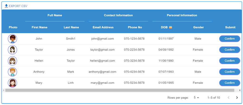
//コラムグループ
const columnGroupingModel: GridColumnGroupingModel = [
{
groupId: "naming",
headerName: "Full Name",
headerAlign: "center",
freeReordering: true,
children: [{ field: "lastName" }, { field: "firstName" }],
},
{
groupId: "contact",
headerName: "Contact Information",
headerAlign: "center",
freeReordering: true,
children: [{ field: "mailAddress" }, { field: "phoneNo" }],
},
{
groupId: "personal",
headerName: "Personal Information",
headerAlign: "center",
freeReordering: true,
children: [{ field: "dob" }, { field: "gender" }],
},
];
//カスタムツールバー作成
const CustomToolbar = (props: any) => {
const apiRef = useGridApiContext();
const handleExport = (options?: GridCsvExportOptions) => {
// エクスポートする列のリストを定義
const columnsToExport = [
"id",
"firstName",
"lastName",
"mailAddress",
"phoneNo",
"dob",
"gender",
];
options = {
...options,
//列の定義
fields: columnsToExport,
//ファイル名定義
fileName: "user_list",
//グループヘーダをエクスポートしない
includeColumnGroupsHeaders: false,
};
apiRef.current.exportDataAsCsv(options);
};
const buttonBaseProps: ButtonProps = {
color: "primary",
size: "small",
};
return (
<div>
<div style={{ marginRight: "auto" }}>
<GridToolbarContainer>
<Button {...buttonBaseProps} onClick={() => handleExport()}>
<FileDownloadIcon /> Export CSV
</Button>
</GridToolbarContainer>
</div>
</div>
);
};
// モーダルを開くための関数
const handleOpen = () => {
setOpen(true);
};
// モーダルを閉じるための関数
const handleClose = () => {
setOpen(false);
};
// Confirmボタンがクリックされた際に、選択された行の詳細情報を表示するための関数
const handleButtonClick = (row: GridRow) => {
const selectedId: number = row["id"] as number;
//選択した行をセット
setSelectedRow(selectedId);
//モーダルを開くための関数を呼び出す
handleOpen();
};
//選択した行の詳細データを取得
const renderRowDetails = (selectedRow: number) => {
const photoName = rows.find((row) => row.id === selectedRow)?.photo;
const imgPath = imagePaths.find(
(img) => img.name === photoName.split(".")[0]
)?.path;
return (
<div>
<img
src={imgPath}
alt={rows.find((row) => row.id === selectedRow)?.photo}
style={{ maxWidth: "75%", height: "auto" }}
/>
<DialogContentText>
<strong>First Name:</strong>{" "}
{rows.find((row) => row.id === selectedRow)?.firstName}
<br />
<strong>Last Name:</strong>{" "}
{rows.find((row) => row.id === selectedRow)?.lastName}
<br />
<strong>Email Address:</strong>{" "}
{rows.find((row) => row.id === selectedRow)?.mailAddress}
<br />
<strong>Phone No:</strong>{" "}
{rows.find((row) => row.id === selectedRow)?.phoneNo}
<br />
<strong>Date of Birth:</strong>{" "}
{rows.find((row) => row.id === selectedRow)?.dob}
<br />
<strong>Gender:</strong>{" "}
{rows.find((row) => row.id === selectedRow)?.gender}
<br />
</DialogContentText>
</div>
);
};
return (
<GridContainer>
<CustomDataGrid
//システムオーバーライドと追加のCSSスタイルを定義できるシステムプロ
sx={{
boxShadow: 2,
border: 2,
borderColor: "primary.light",
"& .MuiDataGrid-cell:hover": {
color: "primary.main",
},
}}
//行セット
rows={rows}
//列セット
columns={columns}
experimentalFeatures={{ columnGrouping: true }}
//グリッドの高さは動的で、グリッド内の行数に従い
autoHeight
//コンポーネントのUIを使用してpageSizeを動的に選択
pageSizeOptions={[5, 10, 15, 20]}
//初期設定
initialState={{
pagination: {
paginationModel: { page: 0, pageSize: 5 },
},
}}
//行選択モードを無効化
rowSelection={false}
slots={{
toolbar: CustomToolbar,
}}
columnGroupingModel={columnGroupingModel}
/>
{/* ダイアログコンポーネント */}
<Dialog open={open} onClose={handleClose}>
<DialogTitle>Row Details</DialogTitle>
<DialogContent>
{selectedRow && renderRowDetails(selectedRow)}
</DialogContent>
<DialogActions>
<Button onClick={handleClose} color="primary">
Close
</Button>
</DialogActions>
</Dialog>
</GridContainer>
);
}
export default MuiDataGrid;
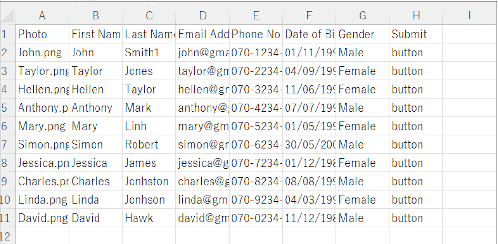
出力画面:
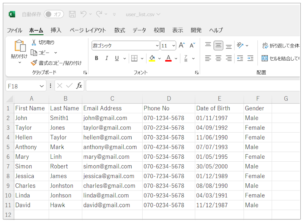
出力ファイル:user_list.csv